

Reclaiming forgotten plant wisdom through a visual identity as rooted, wild, and whimsical as the woman behind it.
Client:
Yarrow Lane Herbs
Year:
2025
Services:
- Visual Identity
- Website Refinements
Context
Most of us don’t know what grows in our own backyards, let alone which plants can heal us. The knowledge of herbal remedies that once passed from generation to generation has been replaced by shelves of processed supplements, over-the-counter medicine, and a general sense that the plants around us are irrelevant, perhaps even annoying.
One Irish woman is reclaiming the lost wisdom. With the belief that “if you have a body then herbs are for you”, Laura Darcy’s business Yarrow Lane Herbs reconnects people to the land they stand on.
Problems
- Laura knew her online presence wasn’t living up to who she is or what she has to offer. “Meet me in person, and you’ll sign up for my course or buy my box. Meet me online, and you’ll skip right over me,” she said.
- To fix that, she bought our Showit website template, hoping for a fresh start. But not long after, she messaged us, overwhelmed and asking for our help with pulling it all together. We dug deeper and quickly learned that actually, the template and Showit as a platform weren’t the problem. The issue was choice paralysis. Without a clearly defined brand identity, even picking a shade of green for her website became a four-day rabbit hole.
Solution
Customising the template would’ve only patched the symptom. To address the root problem, we decided to give Yarrow Lane Herbs a full visual identity. One Sprint later, the founder had a clear set of visuals that finally matched her quirky energy, and could be applied to her website and other areas of business.
One woman and the plants
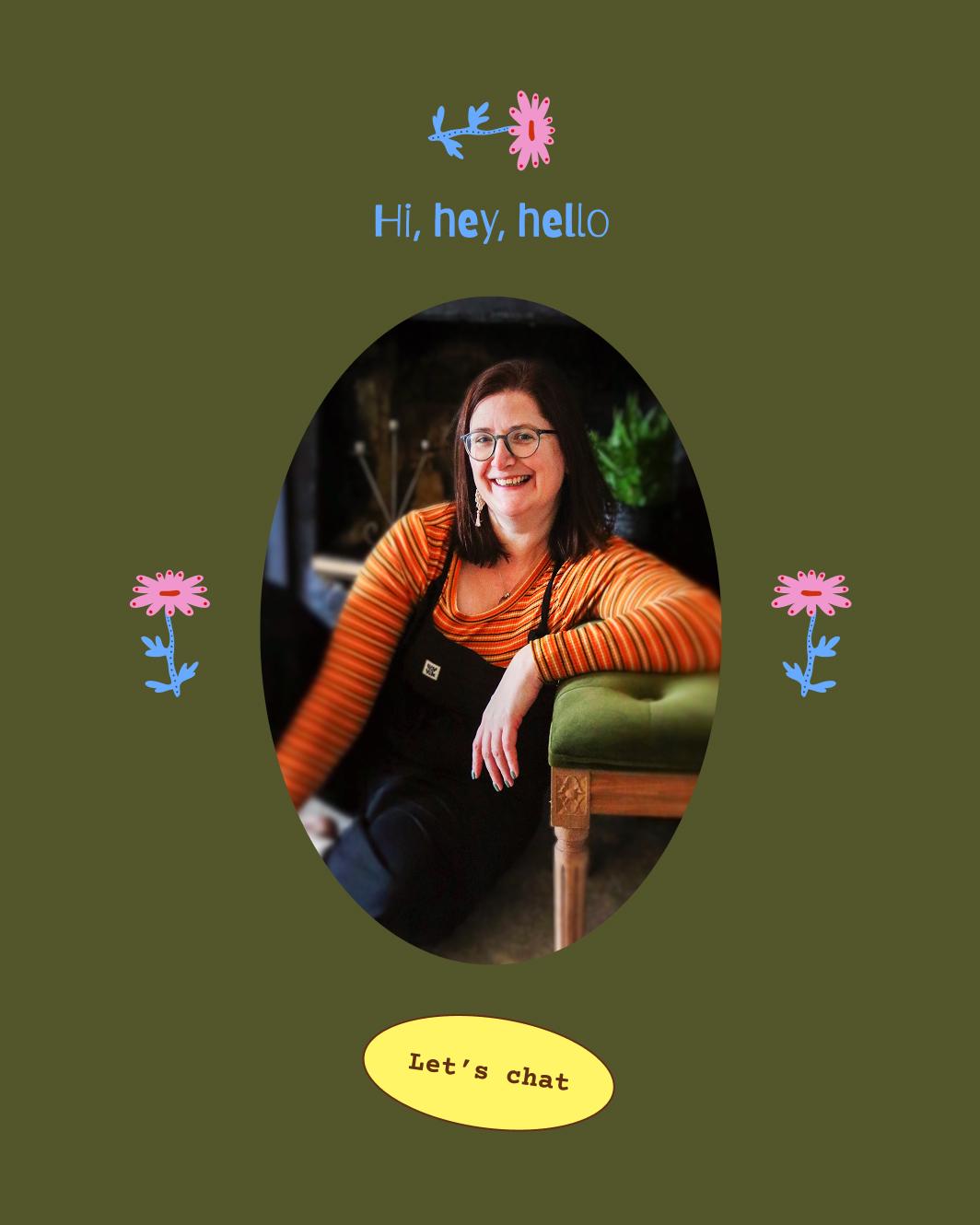
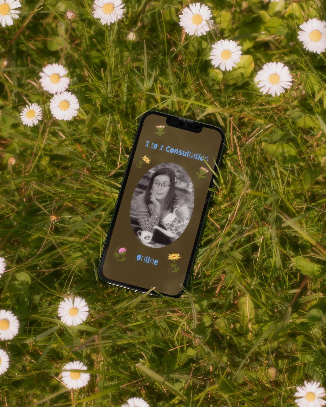
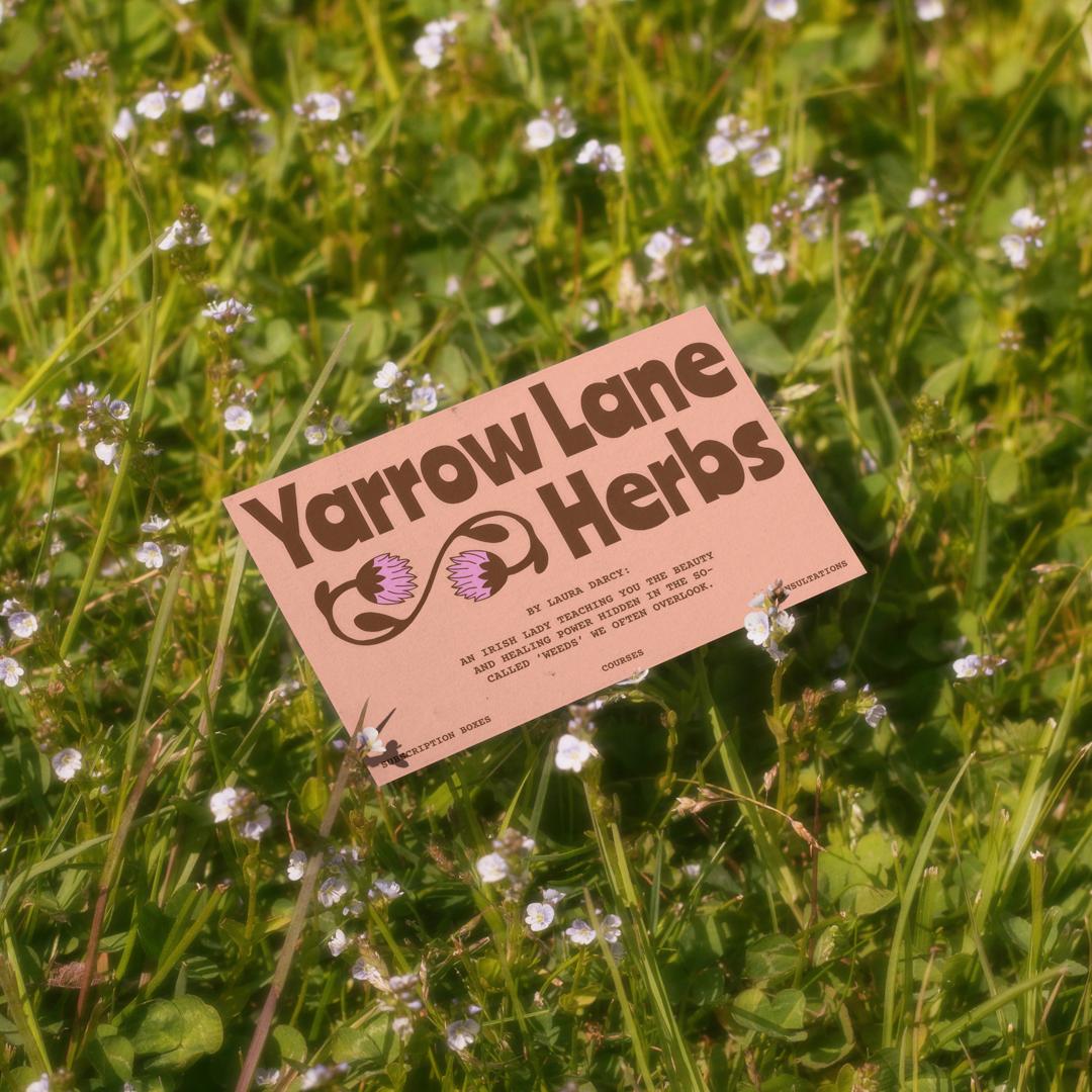
“If I don’t talk about weeds in the first 5 minutes of meeting you, check that I am still breathing”, Laura likes to say. It shows: Yarrow Lane is her calling. Both Laura’s great-grandmother Ellen and grandmother Mags used plants to heal people. Now, she carries on the tradition. Being so deeply entwined with the business posed a challenge. The brand needed to mirror Laura’s personality but also stand as a credible business in its own right. Finding that balance between Laura, the person, and Yarrow Lane, the brand, became the foundation of our approach.
Encoding Laura into Yarrow Lane
Peel back the layers, and it’s clear: Laura’s a hippie at heart. Where others dress up wellness as luxury, she’s out there barefoot in the garden with a “you can do this too” attitude. Her mission is to make herbalism accessible to everyone, not just the seasoned gardeners, wellness elites, or people ready to spend years studying plants.
Translating that energy into visuals could’ve easily slipped into predictable “natural” territory or, on the other end of the spectrum, a cheesy 70s revival that feels more themed than true. But neither is fully Laura, or Yarrow Lane.
Instead, we blended different influences to create a well-rounded visual world that celebrates freedom, rebellion and a return to nature’s wild, magical messiness.
Professional” wasn’t the primary concern
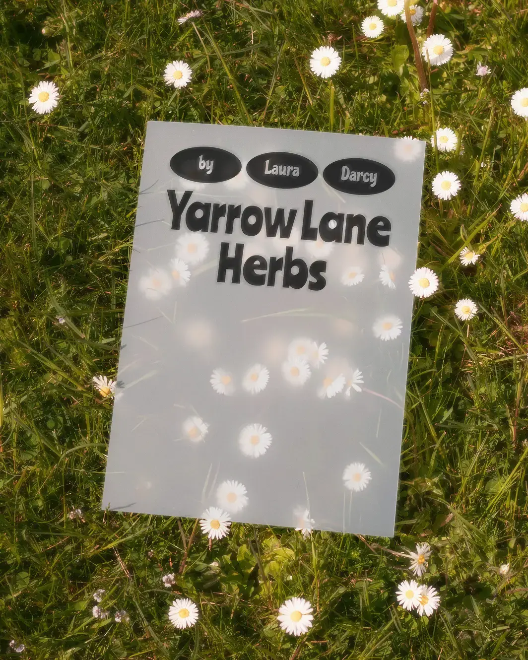
The new logo works because it’s whimsical, not in spite of it. While many believe a logo needs to be ultra “professional” and spell out exactly what a business does, its main function is simply to represent the brand well. In its purest form, that means its spirit. Clearly, Yarrow Lane Herbs has a lot of soul. Despite being a legit business, it’s very removed from the greedy corporate world, and founded by a quirky woman. That had to come through. Trustworthiness is an almost natural side effect of good design that matches the brand’s promise.
Painting a garden through a lens of storytelling
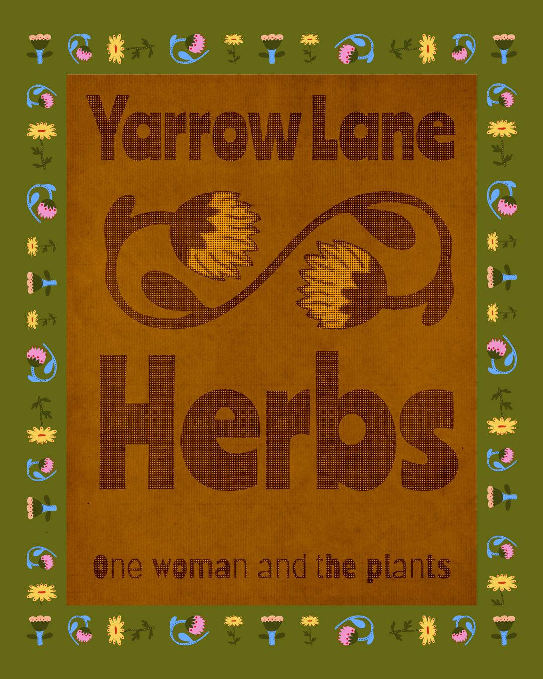
Anyone who’s been to a class knows Laura as a storyteller of Irish plant folklore. She believes stories are the best way to learn, so she tells plenty. Coincidentally, we tell stories too, only visually. And that’s what we started working on next.
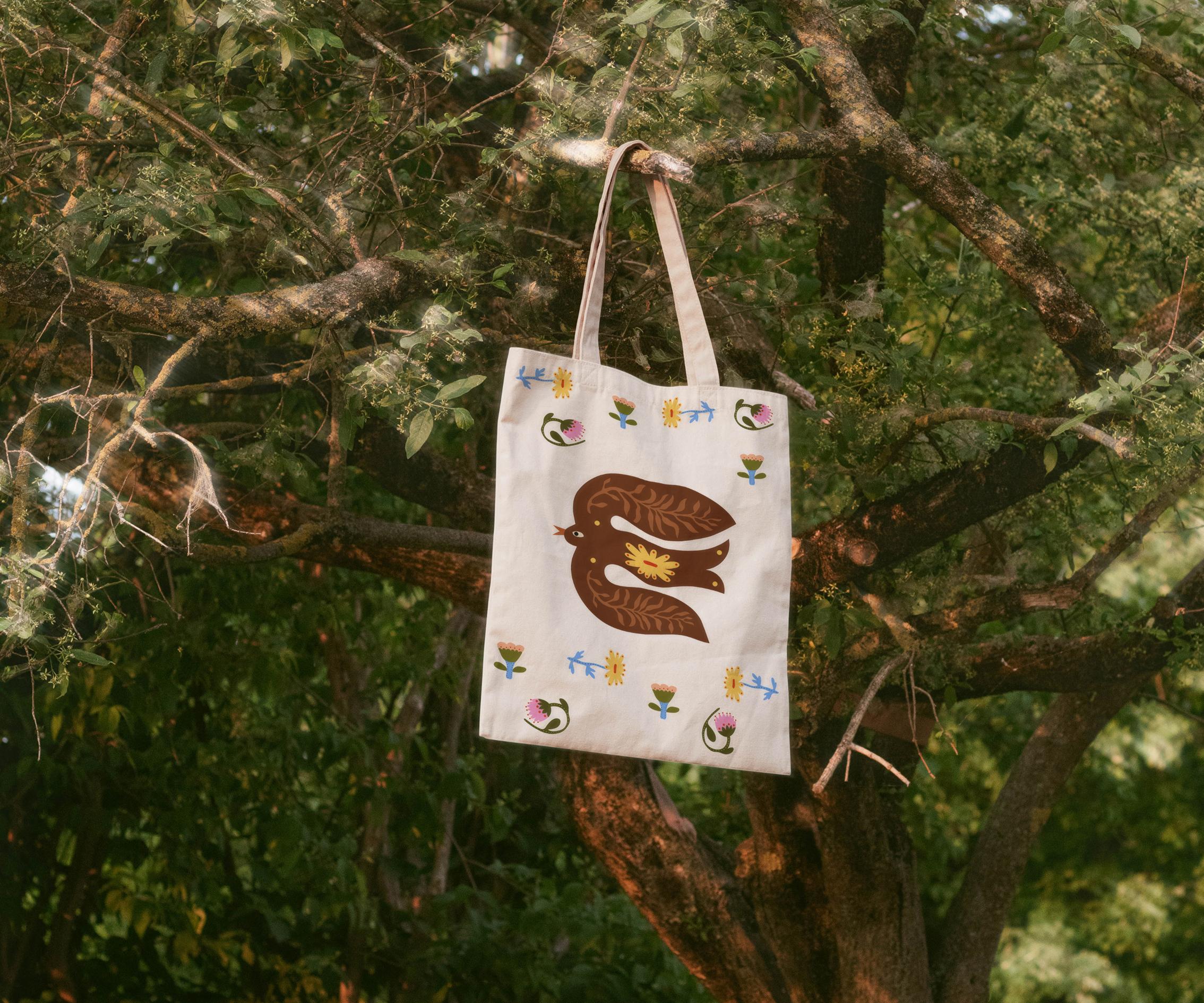
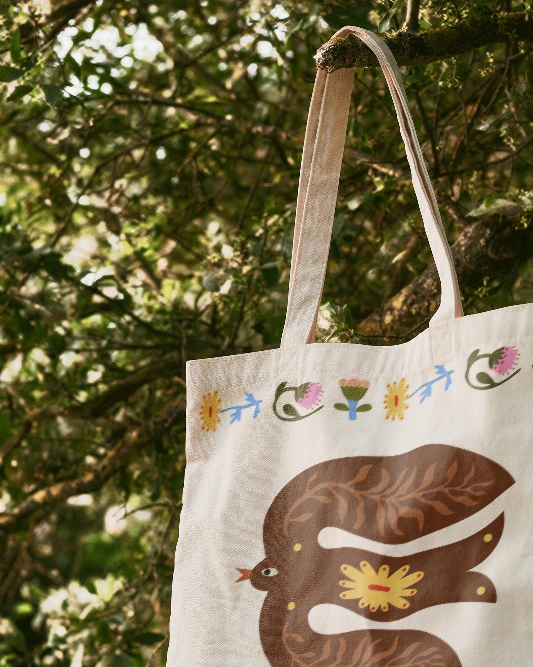
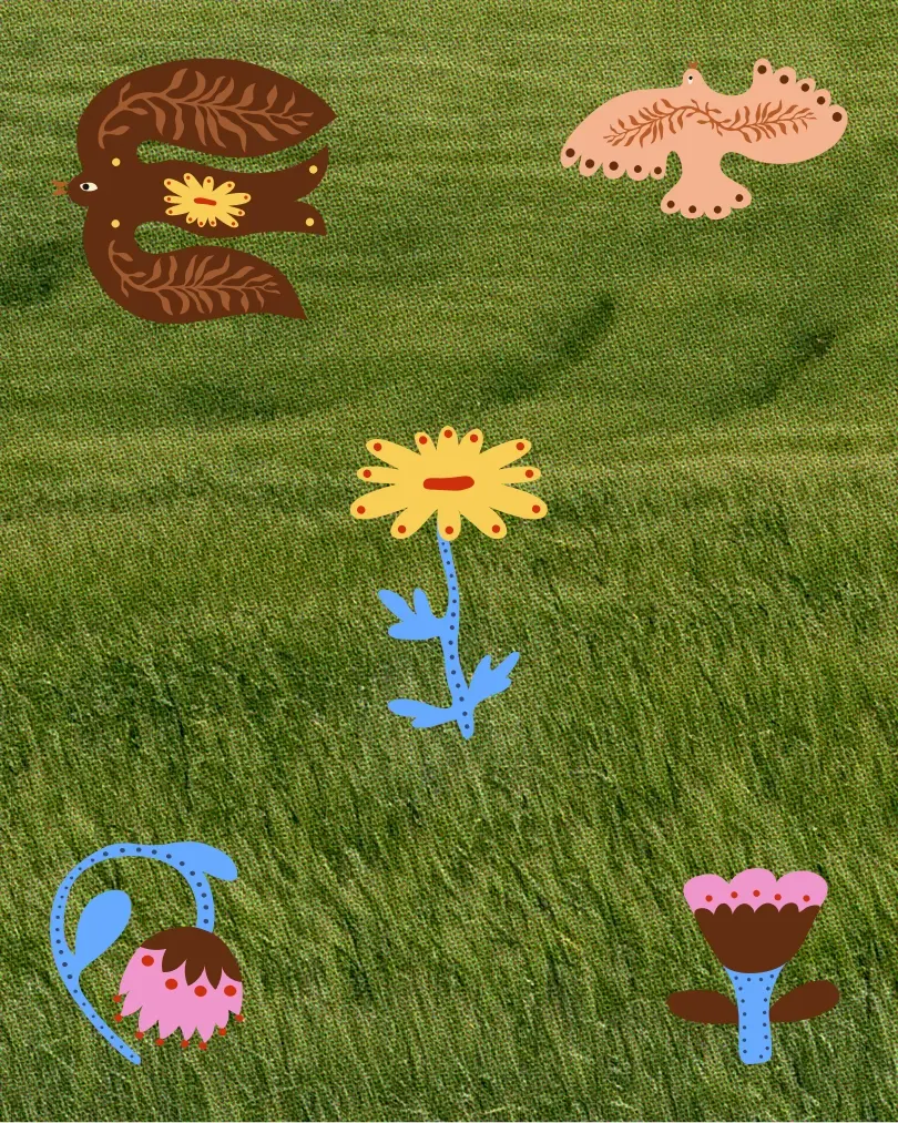
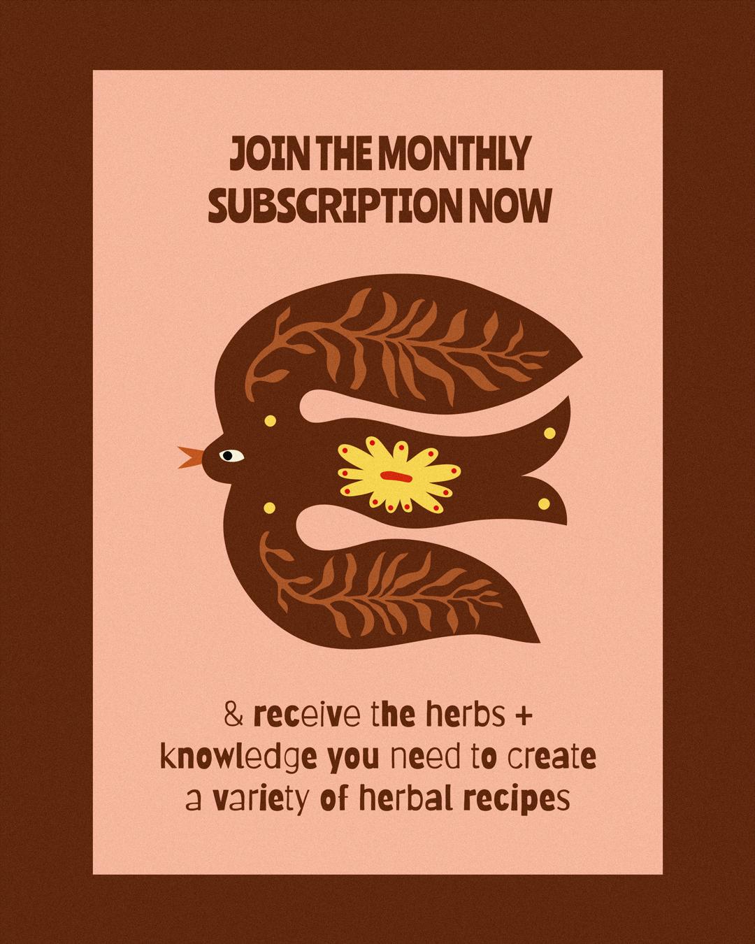
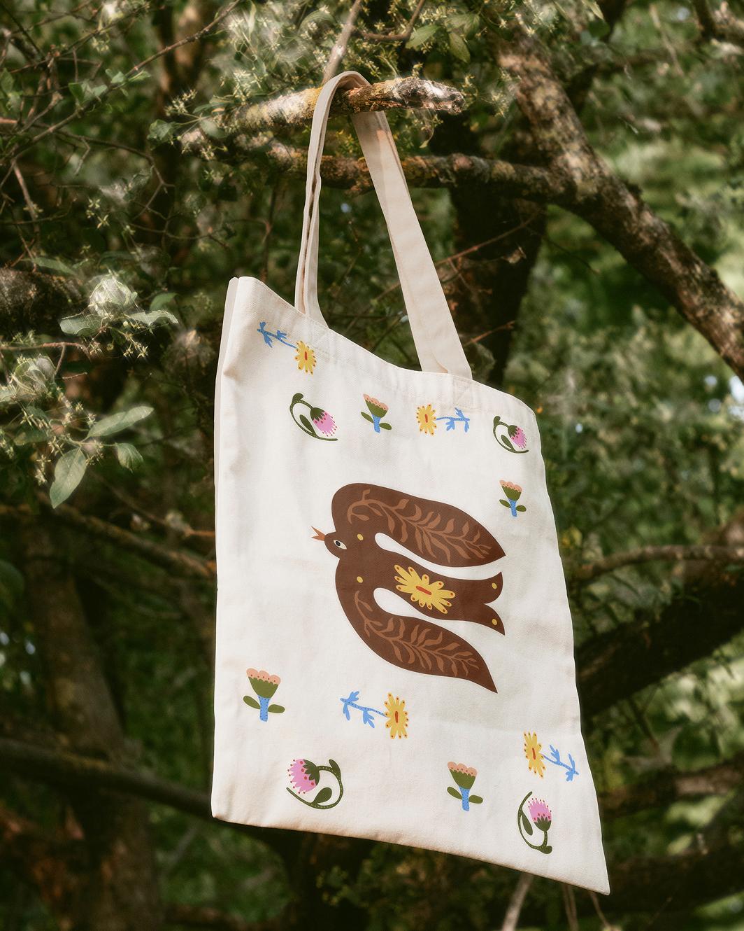
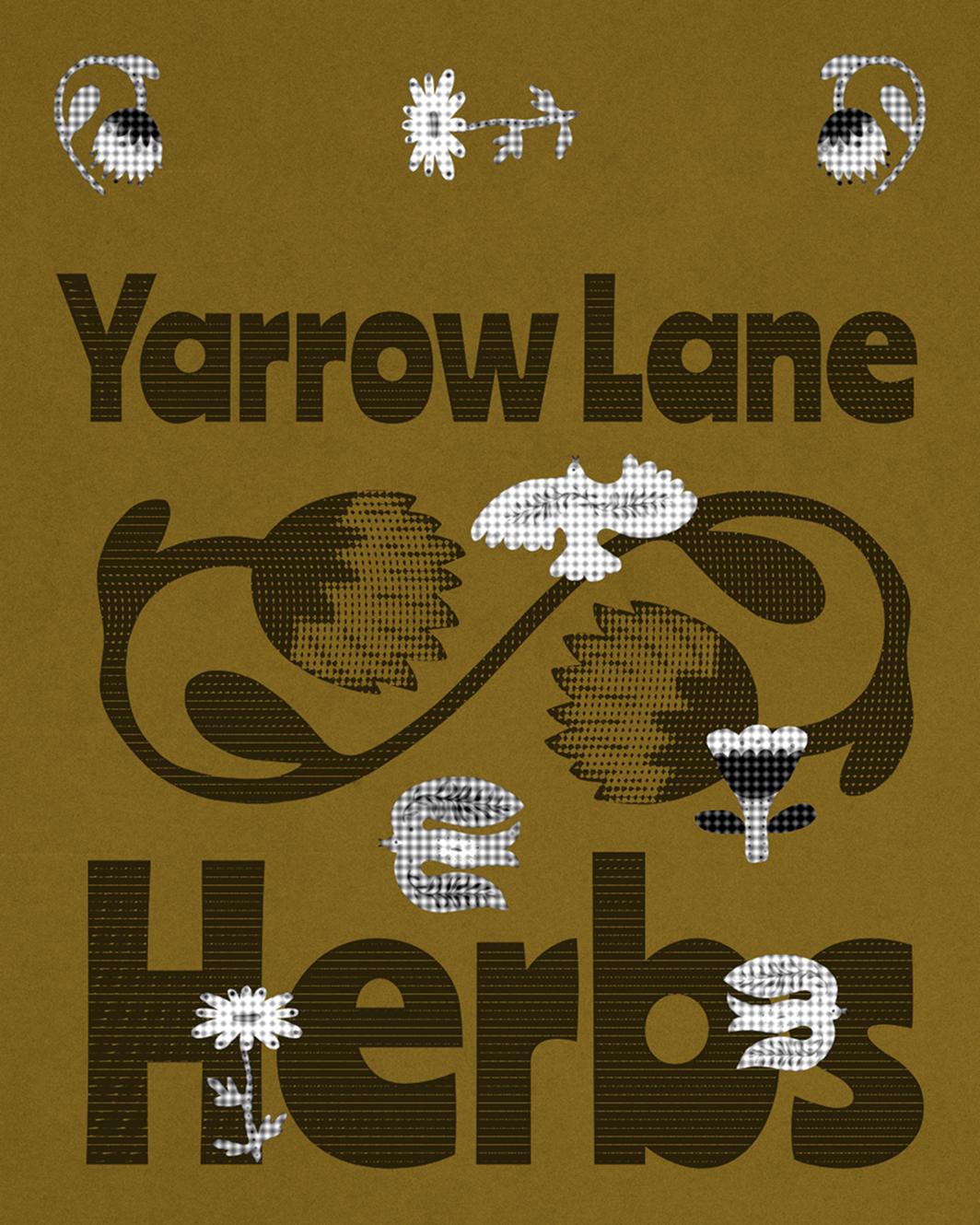
Now that we had decoded the strategy, set the creative direction, and put a logo suite in place, we were ready to build out the details that would truly bring the brand to life. Every illustrated motif became part of the bigger narrative. Together, they tell the story of stepping into a garden. None of the birds or plants here are literal depictions of nature; everything is filtered through folklore and play, giving Yarrow Lane Herbs an ownable visual language as warm, down-to-earth, and whimsical as Laura’s teaching.
Weighing up DIY against a four-figure build
In November 2024, we ran a workshop on building websites that sell. Laura showed up curious and left determined to finally tackle hers. She was realistic, though: she wasn’t a “tech-y” person, so starting from a blank canvas felt daunting. A fully custom site costing multiple four figures wasn’t an option either.
In such cases, good templates are a clever middle ground. However, Laura quickly learned that even the best template isn’t magic. Swapping in content is easy; making it feel uniquely yours is harder when you don’t know who you are visually. Getting her branding sorted for the first time made all the difference.
Headspace to focus on what matters
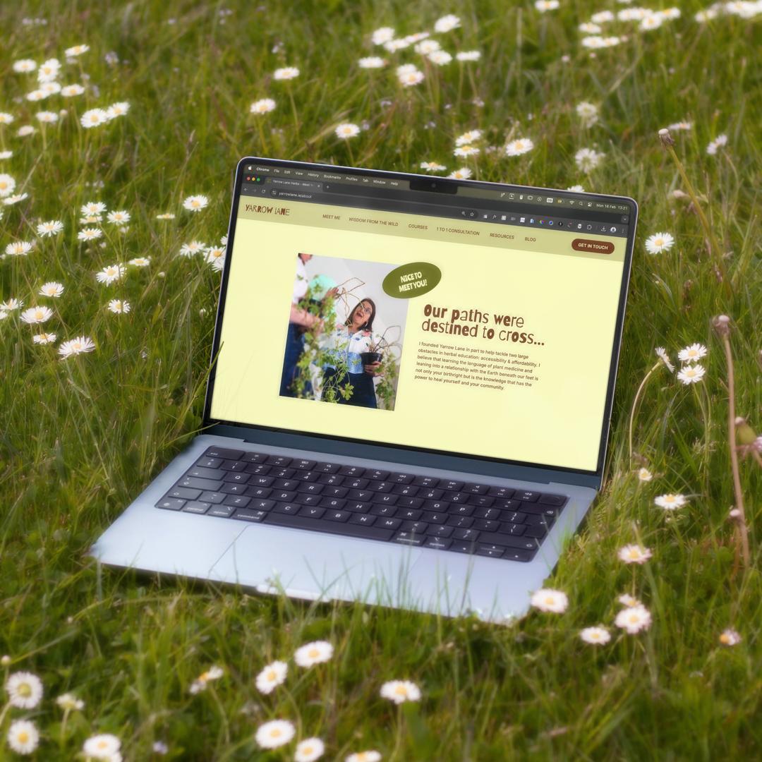
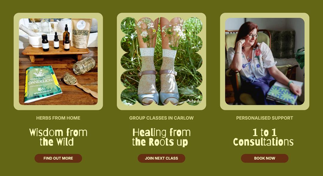
With her new design guidelines in hand, building Yarrow Lane’s website stopped being an uphill battle. All those endless micro-decisions (like button colours) had been taken off Laura’s plate. With so much time and headaches saved, she could get back to the tasks that would actually bring in cash: teaching, connecting, and selling.
And the final result?
By investing in branding, Laura gained a long-term solution for all future applications, not just one finished end-product.
The best thing is that we only stepped in at the end of her website creation for a designer’s polish. The rest, the woman behind Yarrow Lane Herbs managed to do completely on her own.
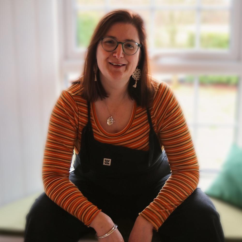
In the words of Founder of Laura:
“Having branding done has been a game changer for a one woman business like me. Everything comes so much easier. It’s a joy to write a newsletter now because I no longer have to spend time worrying about fonts, colours, themes. Bitemark was able to take my personality, my quirky vibe and create branding that I feel proud to show off. It makes me stand out for all the right reasons, and the best part is that the branding matches my personality so well that students and clients often comment on it.”
