


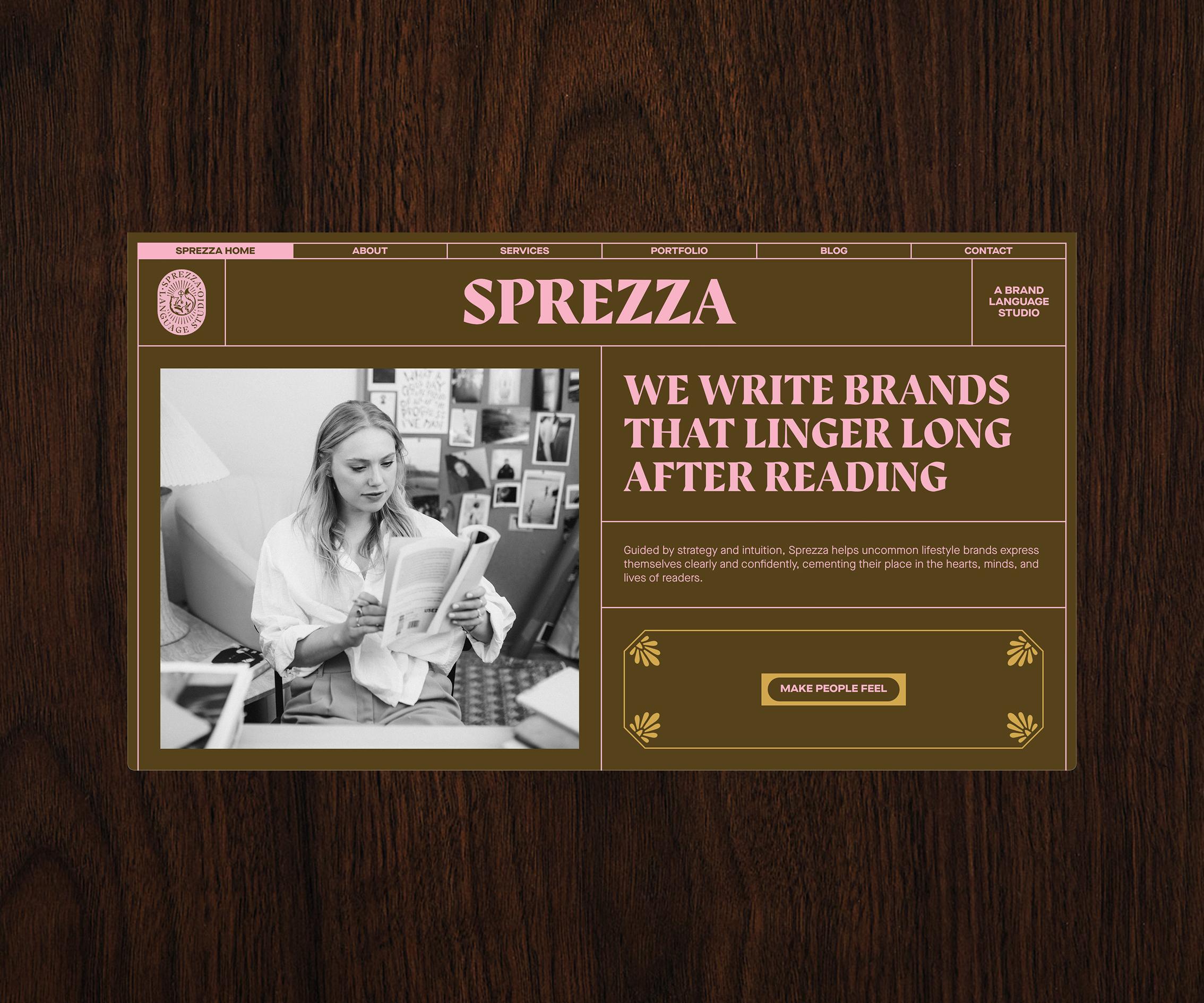
Turning a language studio's biggest blind spot into its most imaginative brand touchpoint.
Client:
Sprezza
Year:
2024
Services:
- Website
- Visual Identity Refinements
- Marketing Materials
Context
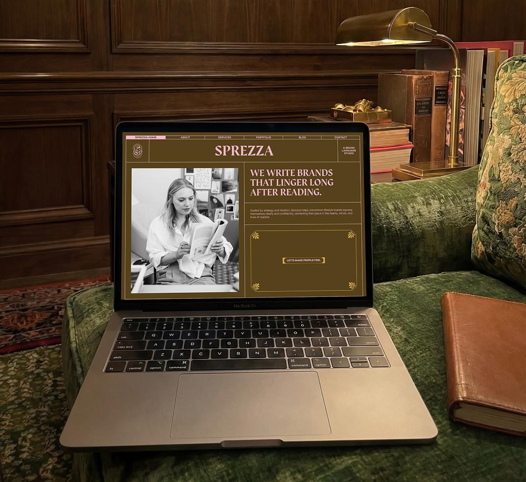
Sprezza is a language studio that helps uncommon lifestyle brands articulate their message with intrigue and delight, to write brands that linger long after reading. That same whimsy inspired the new website and further brand applications we helped create: a Wes Anderson-esque playground for exploring Sprezza’s offerings.
Problems
- Founder Emma had over four years and 100+ projects under her belt, but her own studio’s website didn’t yet reflect that philosophy of creating memorable experiences.
- She wanted her brand to walk the talk by mirroring the immersion that she creates for her clients.
Solution
We designed a website that became Sprezza’s biggest case study. Packed with interactive touches, hidden surprises, a whimsical aesthetic, and of course, Emma’s delightful words, it lets visitors really experience the brand rather than just read about it. It shows that clarity doesn’t have to be boring, and fun doesn’t have to be frivolous.
Outside our comfort zone? Good.
The vision for Sprezza was a departure from Bitemark’s then (in Emma’s words) “delightfully macabre portfolio”. It made Emma pause to ask if we would feel confident taking this on, to which we said: 100% yes. What drew Sprezza to us was our unconventional approach to web design, and that isn't tied to one look.
We had never built anything in Sprezza’s style before. That didn't mean we couldn't; and as you're reading this, it's clear it worked.
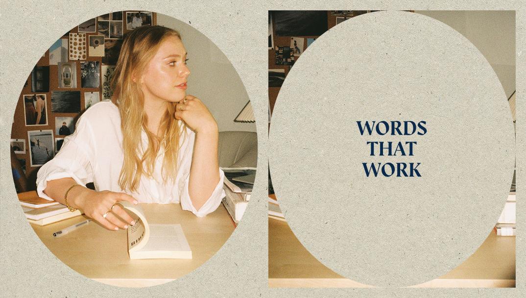
What made this tricky?
When Emma approached us, she was knee-deep mid-rebrand with her brand designer.
Once the guidelines for the visual identity landed in our inbox, we decided to kick off our web project. But we quickly realised that the brand still felt fluid. The website would be the first real test of the branding, and we knew then we’d be helping solidify it along the way.
That meant a period of experimentation, recalibration, and three-way collaboration before we could fully begin. But it was worth it to make sure Sprezza’s vision stayed intact, while still letting the website do its thing.
A digital newspaper
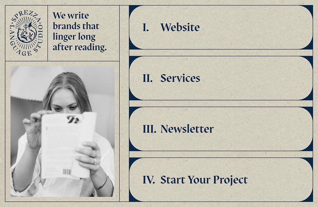
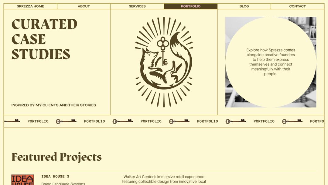
Early brand moodboards leaned heavily on analogue inspiration, which gave us the big idea for a newspaper concept. It could make the site feel physical and tactile, despite living on the web, and give us structure while leaving room to inject playfulness.
The Scrabble effect
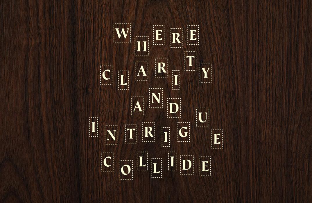
One of the most playful details we built into Sprezza’s digital home is what we call “the Scrabble effect”: scattered letters that snap together to form words as you scroll. Every refresh feels a little different because it’s coded to be random, like language assembling itself in real time. It’s a clear nod to Sprezza’s craft: playing with letters, words, and meaning.
From half-baked to fully formed
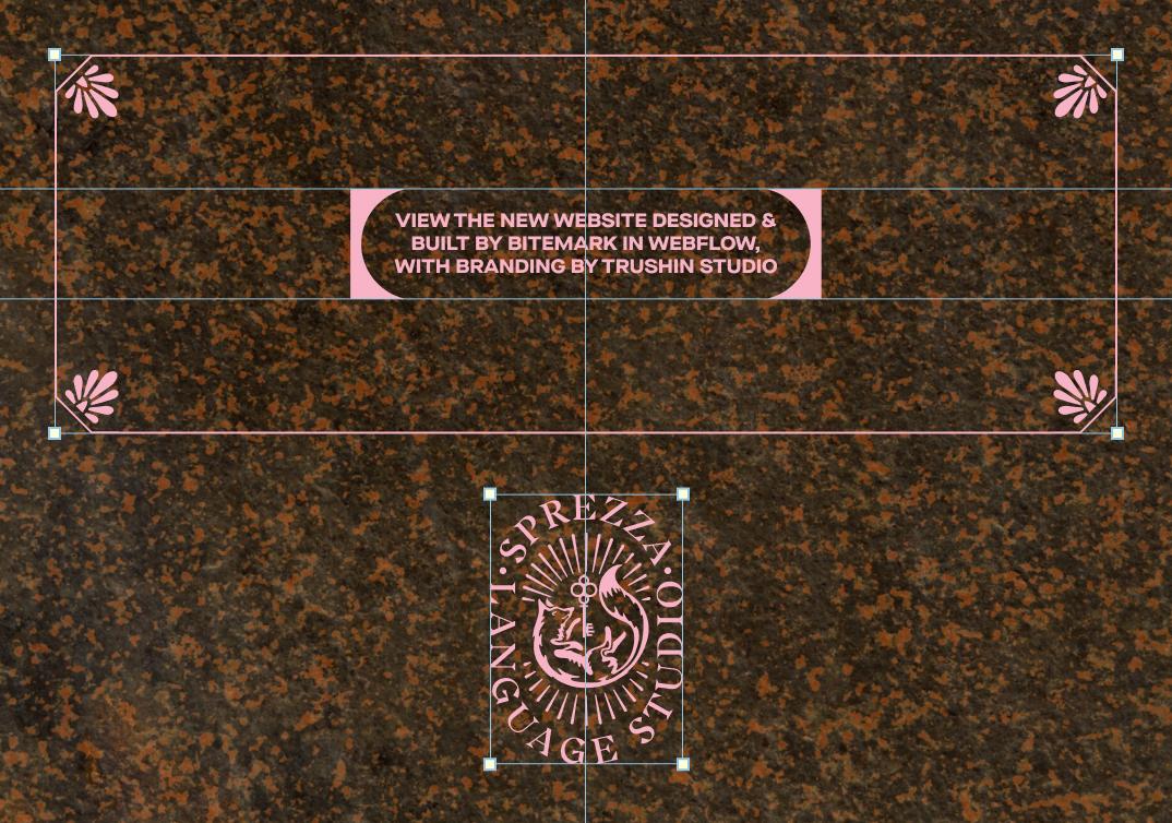
In the process of running Sprezza’s newly established identity through the fire of its biggest application—the website—we helped shape it into something sharper, more consistent, and future-proof.
To make sure the branding could live beyond the site, we packaged the system we had created into a practical set of compact guidelines: (revised) colours, font styles and sizing, padding and gaps, grid lines, and all the quirky little assets that make Sprezza, Sprezza.
Expanding beyond the website
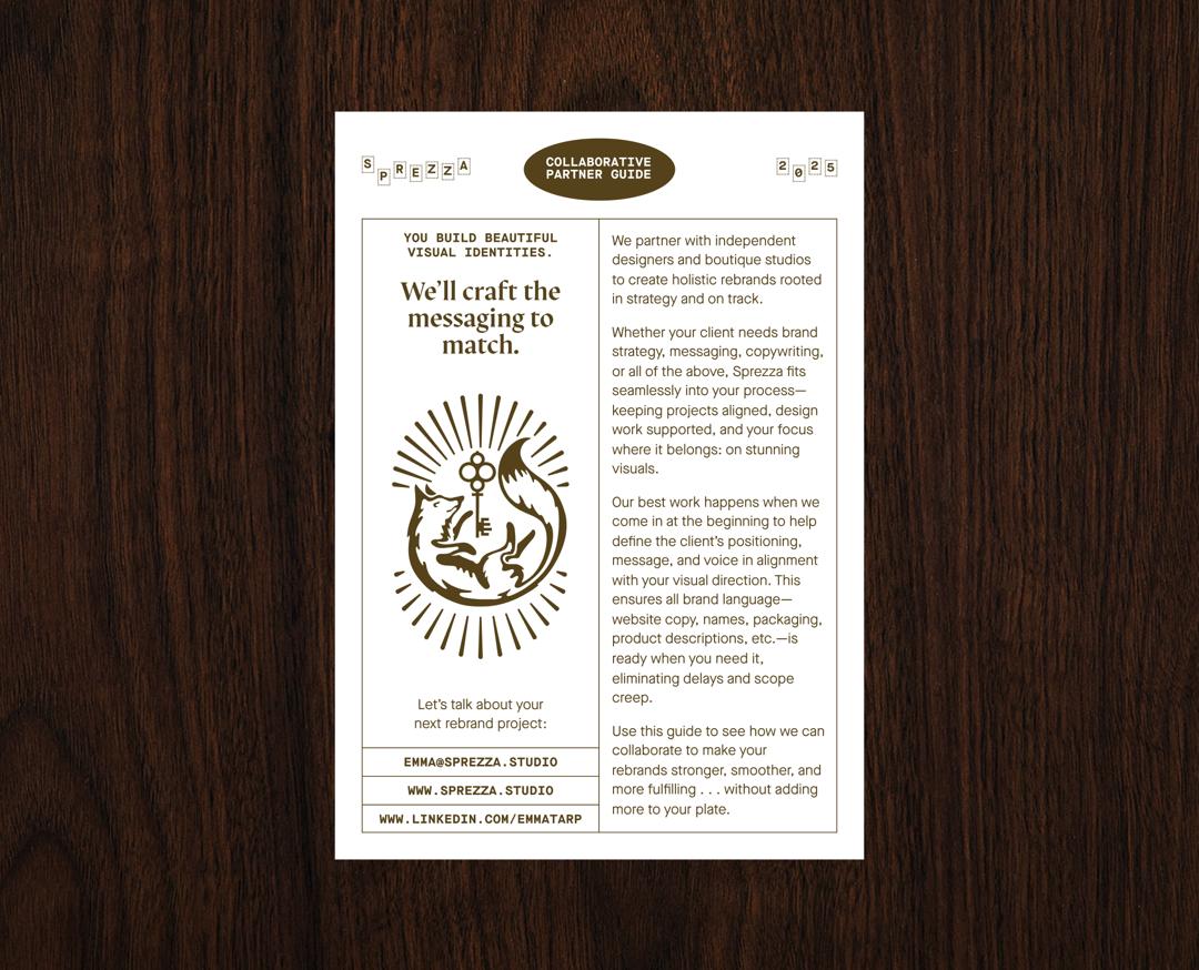
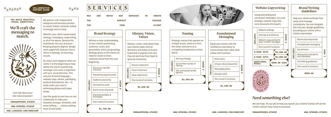
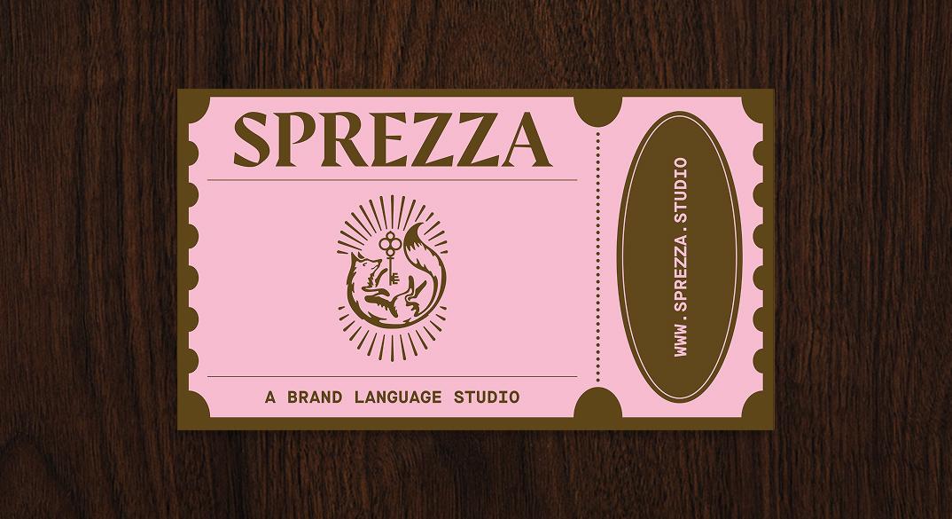
Those guidelines we designed proved their worth almost immediately. Just a few months later, Emma came back with a new challenge: she wanted to make her mark at in-person networking events. With the system already in place, it was easy to extend Sprezza’s visual universe into print: business cards inspired by vintage cinema tickets (QR code included linking back to her digital base) and a pocket-sized service guide: a 4-page A5 booklet.
And the final result?
Sprezza gained a true digital home that feels as intentional, layered, and imaginative as the words it crafts. What started as an identity in flux, grew into a full ecosystem: from the website, to brand guidelines, to print touchpoints that carry the same energy offline. Most importantly, it gave Emma the confidence to show up exactly as she wanted to be seen.
In the words of Founder of Emma:
“Bitemark has a rare intuition for the details that make a web experience special and extraordinary. They were able to tune into my wavelength and bring my vibe and vision to life in a way that was unexpected yet so so fitting, symbolically meaningful yet practical.”
