

A few days and fresh eyes… that’s all a fellow creative studio needed to finally have a brand as distinctive as its work.
Client:
Corner Booth
Year:
2025
Services:
- Visual Identity
Context
Forking out money on a designer and briefing them on your vision, only to end up with something that looks like it could belong to anyone... it's a more common experience than it should be.
Corner Booth had built a loyal following on the back of rejecting exactly that. With a tagline that reads "good design, made to order" and the work to back it up, the studio's output in design, digital media, and photography has always encapsulated a unique perspective: cooler, more considered, more personality-forward than the clean-girl-coded visuals dominating their local market in Boise.
Problems
- Corner Booth was so busy doing great work for clients that their own brand presence was more of an afterthought. The cobbler's children had no shoes, and for a boutique studio whose whole value proposition is creative work that reflects the brand while also setting it apart, that was starting to matter.
- But who do you trust to do it as well as you would yourself, or better?
Solution
Founder Makenzie reached out to us knowing exactly why: "there was nobody else [she] would trust with [her] brand." We didn't take that lightly.
During a Sprint, we built out Corner Booth's first real visual identity. What emerged was exactly what the studio had always been in practice, finally made visible: cool people making cool things, for the independent brands that deserve better than unoriginal templates and recycled ideas.
The hardest brief
Designing for other designers is either the easiest or the hardest brief you can get. There's no educating the client on why something works. They already know. Which means there's nowhere to hide.
We were also acutely aware that the visual identity we would craft wouldn’t just have to fulfil the usual success requirements of fitting a strategy, but also make sense as a container for Corner Booth’s in-house produced graphics and photographs. Essentially, there couldn’t be a disconnect between our visuals and theirs if the branding was to accurately represent the brand. Challenge accepted.
Starting from the name
Corner Booth had previously leaned into a western, cowgirl aesthetic: cool, but without much grounding. We wondered if we could anchor the brand in its name to give the visuals more substance.
When we asked Makenzie about its meaning, her answer was immediate: "Who doesn't want to be in a dimly lit corner booth of a restaurant with your best friends sharing apps and drinks and laughing too loud?"
Bingo.

Landing on a world setting
The corner booth living at the heart of the identity was appealing, but going literal with an illustration tied into the logo felt uninspired and too on-the-nose. So instead we asked: if Corner Booth had a physical setting, what would it be?
How about a dive bar on route 66, with old country on the jukebox? It wasn't far from how the studio had previously presented itself, but it didn't feel aspirational enough.
Corner Booth's work lives in the tension between edgy, effortlessly whimsical, and high-end. This called for a direction with more nuance and glamour. What came to mind was this:
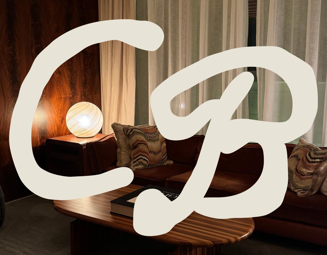
A dimly lit restaurant in a hotel for people who know how to live. Think Chateau Marmont: an iconic status symbol, and yet somewhere people go to party and ride motorcycles through the lobby.
Layered but coherent
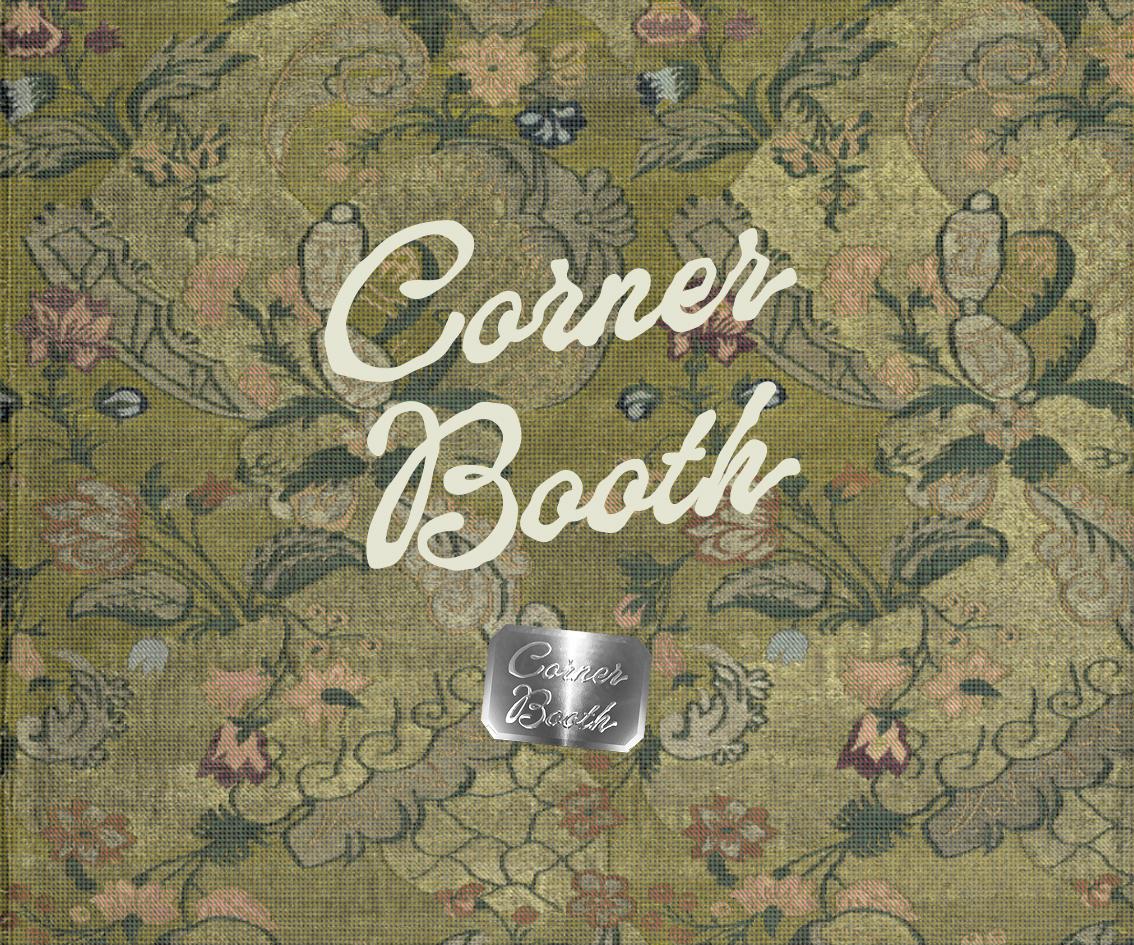
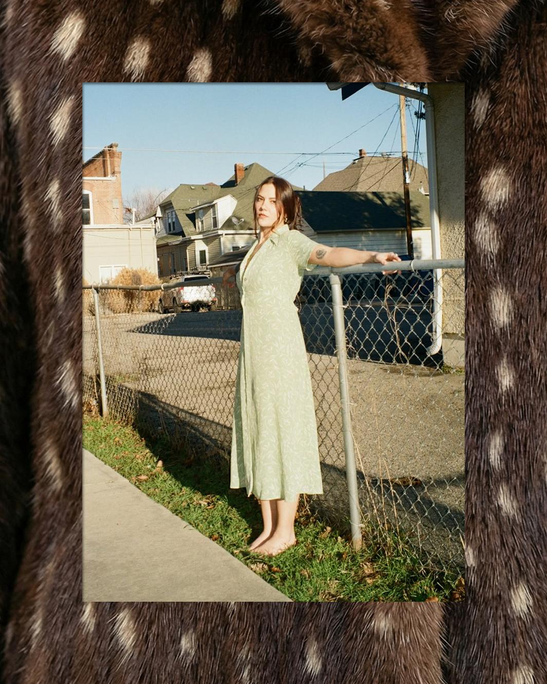
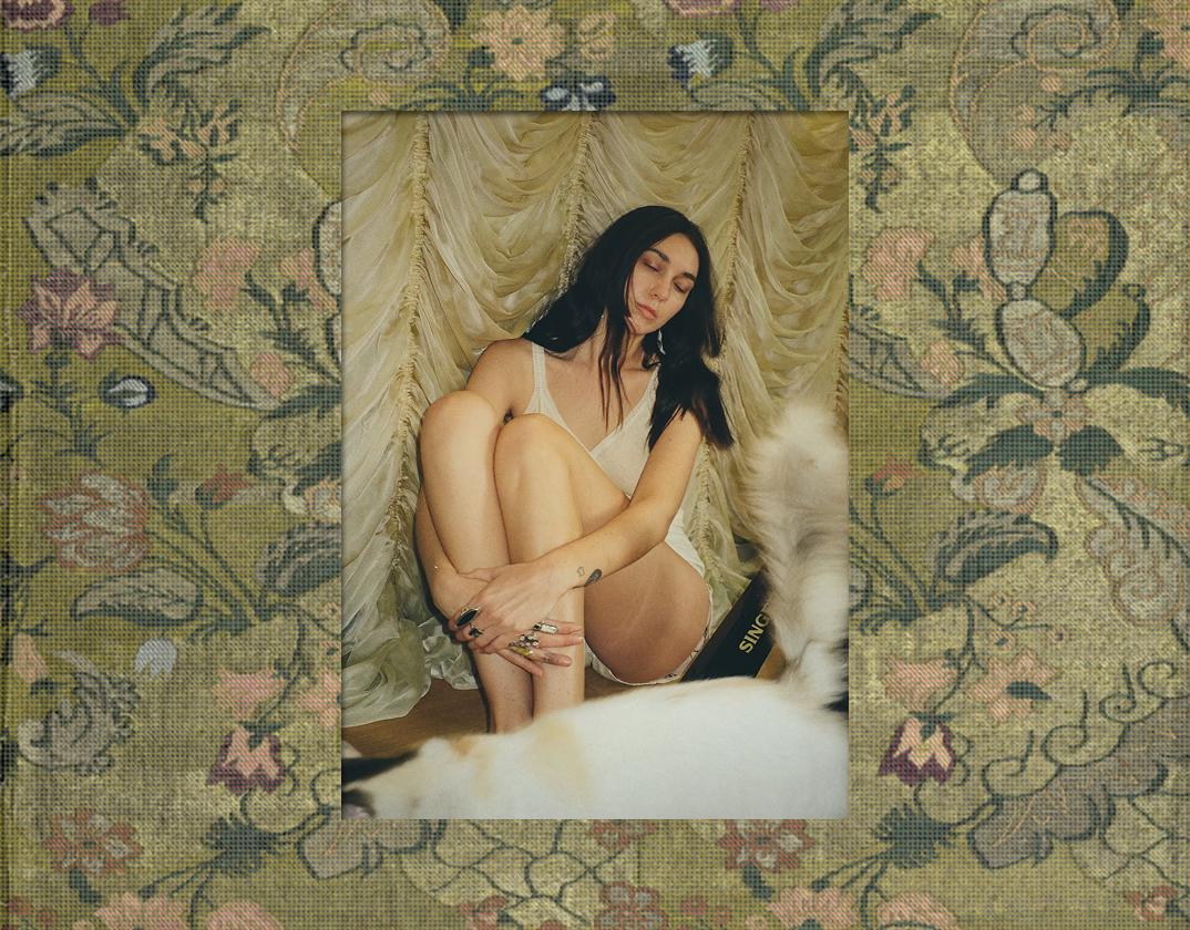
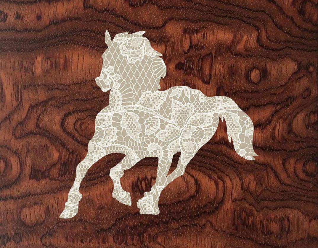
In the development of Corner Booth’s visual language, we referenced ornamental upholstery, luxurious woods, chic textiles, and the spirit of the cool characters inhabiting the lobbies, restaurants, and bars of prestigious hotels.
What emerged is an identity that feels aspirational but not aloof.
Your brand or their brand?
Product-based businesses have it straightforward. Everything they put out lives in their own universe.
Brands who offer creative services don't have that luxury. Their main output is someone else's brand. Which raises a real tension: do you market yourself in your own distinct visual style, or do you let your own brand become a neutral stage?
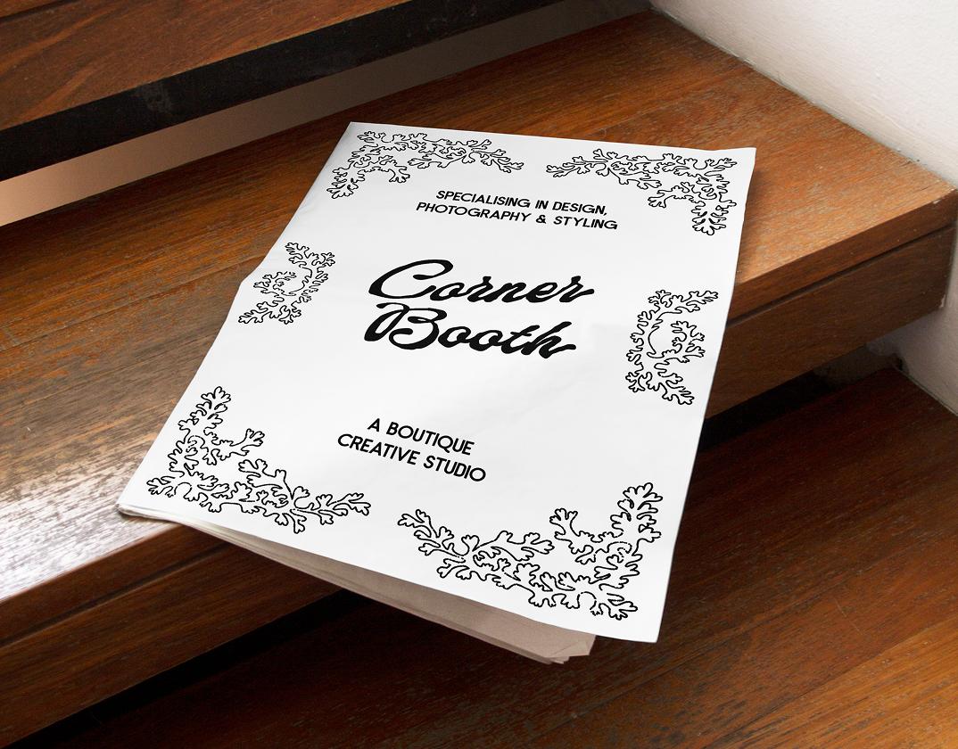
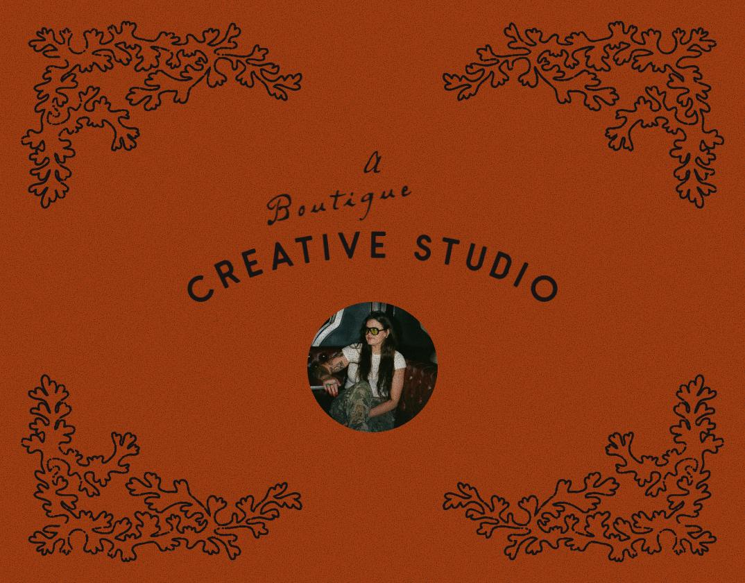
Clearly, “neutral” never was a good descriptor for Corner Booth. It’s also not a positioning strategy we recommended in this competitive market. Yet, they rightfully didn’t want to overpower their work. The only correct approach here was to build a system that can flex: different elements that, at full strength, read very Corner Booth, yet can recede without losing recognition entirely. In this restrained form, the branding acts as a frame.

And the final result?
Corner Booth now has a visual identity that finally matches the quality and personality of the work it represents. But perhaps more than the deliverables themselves, what mattered was what the process unlocked. Handing it off to someone she fully trusted gave Makenzie something harder to measure but just as valuable: the ability to move on.
In the words of Founder of Makenzie:
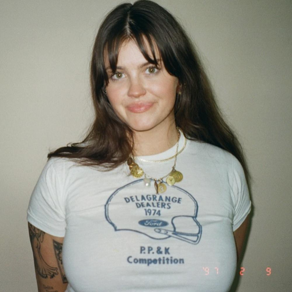
“As a fellow creative and designer- I am PICKY. Before hiring Bitemark, I already knew there was nobody else I would trust with my brand. This has been looming in my business for over a year. I was so burnt out and oversaturated trying to build my own brand. I was impressed with Bitemark’s ability to completely grasp my brand and elevate it. I loved the fast turnaround and can’t believe all they did- I feel like most people take ages. Bitemark had the determination and organization to give everything and more.”
