



Branding Atlanta's most anticipated community pottery studio as a home away from home for everyone.
Client:
East Atlanta Clay
Year:
2025
Services:
- Visual Identity
- Marketing Materials
Context
We live in an age of constant connection that somehow keeps making us lonelier. And there's something else no screen can give us: the therapeutic joy of making something with our own hands.
No wonder then that analog hobbies in shared spaces have become popular. So popular that demand in many cities far outweighs access. Take Atlanta: its most beloved pottery studios have waitlists over 1,000 people long.
To close this gap, East Atlanta Clay is opening its doors this year; a creative refuge for everyone, especially BIPOC and LGBTQ+ folks who are often excluded from traditional art spaces.
Problems
- Building a ceramic studio for everyone comes with a particular branding challenge: how do you appeal to a seven-year-old, a retired grandmother, a seasoned potter, and someone who has never touched clay all at once?
- The big risk of trying to talk to everyone is that you end up talking to no one.
Solution
To make East Atlanta Clay universally inviting, we led with the one thing that cuts across every age, background, and skill level: play.
The result of our Sprint is a visual identity that encapsulates the fun of working with clay. Warm and unprecious.
Third places are hard to come by
As more adults step back from social drinking, going out “IRL” becomes even more difficult. Where do you meet people? What do you do in your spare time?
Many found their answer in “grandma hobbies”, organised by local studios. But if the social aspect is secondary to the outcome, these environments quickly start to feel more like cold production spaces than social hangouts.
Founder Ashanti knew what it should feel like. Working at various places in New York, she saw how the right environment keeps people in the studio all night finishing their work and creates bonds that extend past the studio walls. She wanted to bring that to her community in Atlanta, with subsidised pricing for those in need, pottery residencies, and partnerships with schools to offer free art classes.
Proof of concept
When East Atlanta Clay launched a Kickstarter to cover their basic setup, the response confirmed real appetite for the concept: they exceeded their $23,600 goal with 168 backers.
It was around this time that EAC founder Ashanti approached us, knowing that early momentum is only the beginning. Community support had validated the idea, but to grow beyond that first wave, the brand needed clarity and distinction. So we got to work.
Shortly after completing the identity, Ashanti shared: "Everyone loves the branding. We have a distinctive logo and colour scheme that is already so loved."
A visual language constructed from meaning
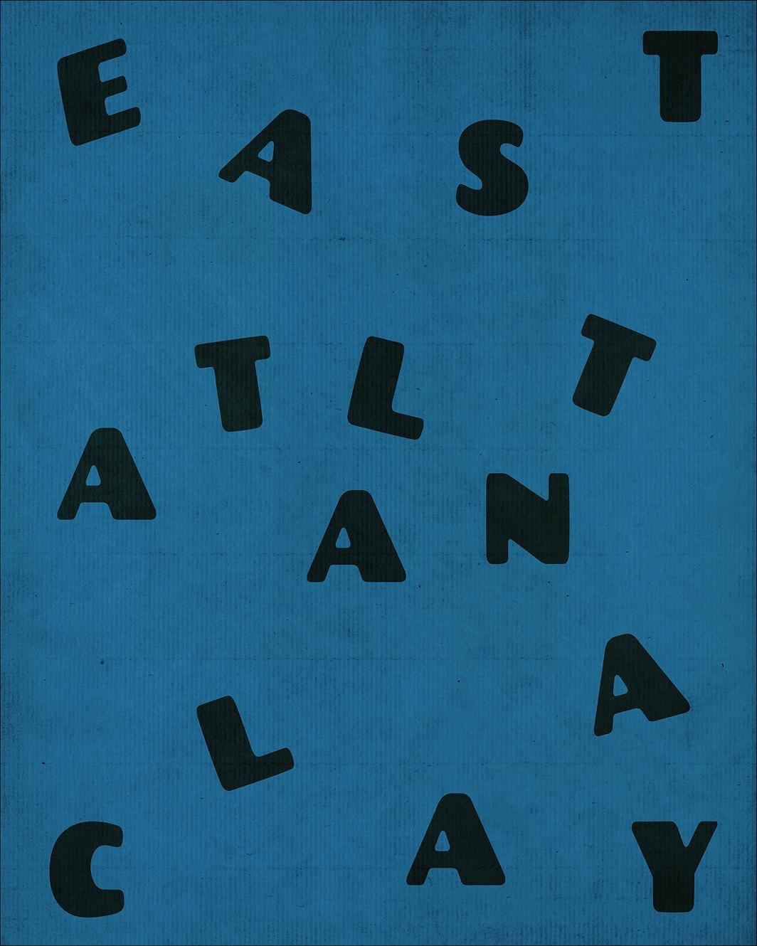
Clay was the inspiration behind many of the elements we designed. It’s a blobby, imperfect, and tactile material that takes the shape of whatever you give it.
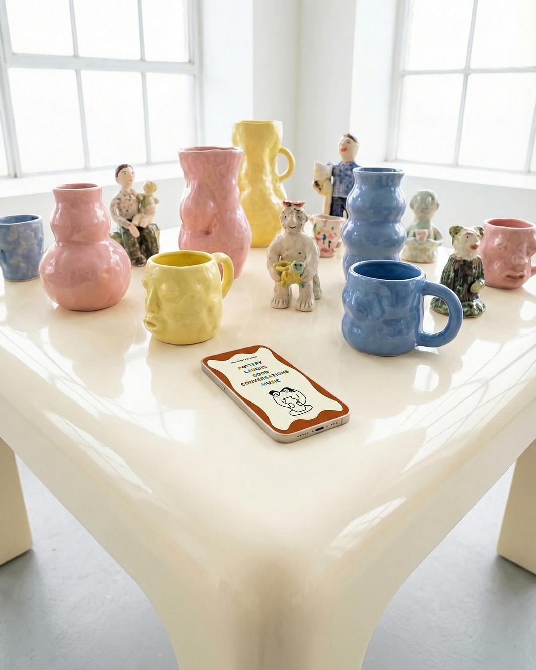
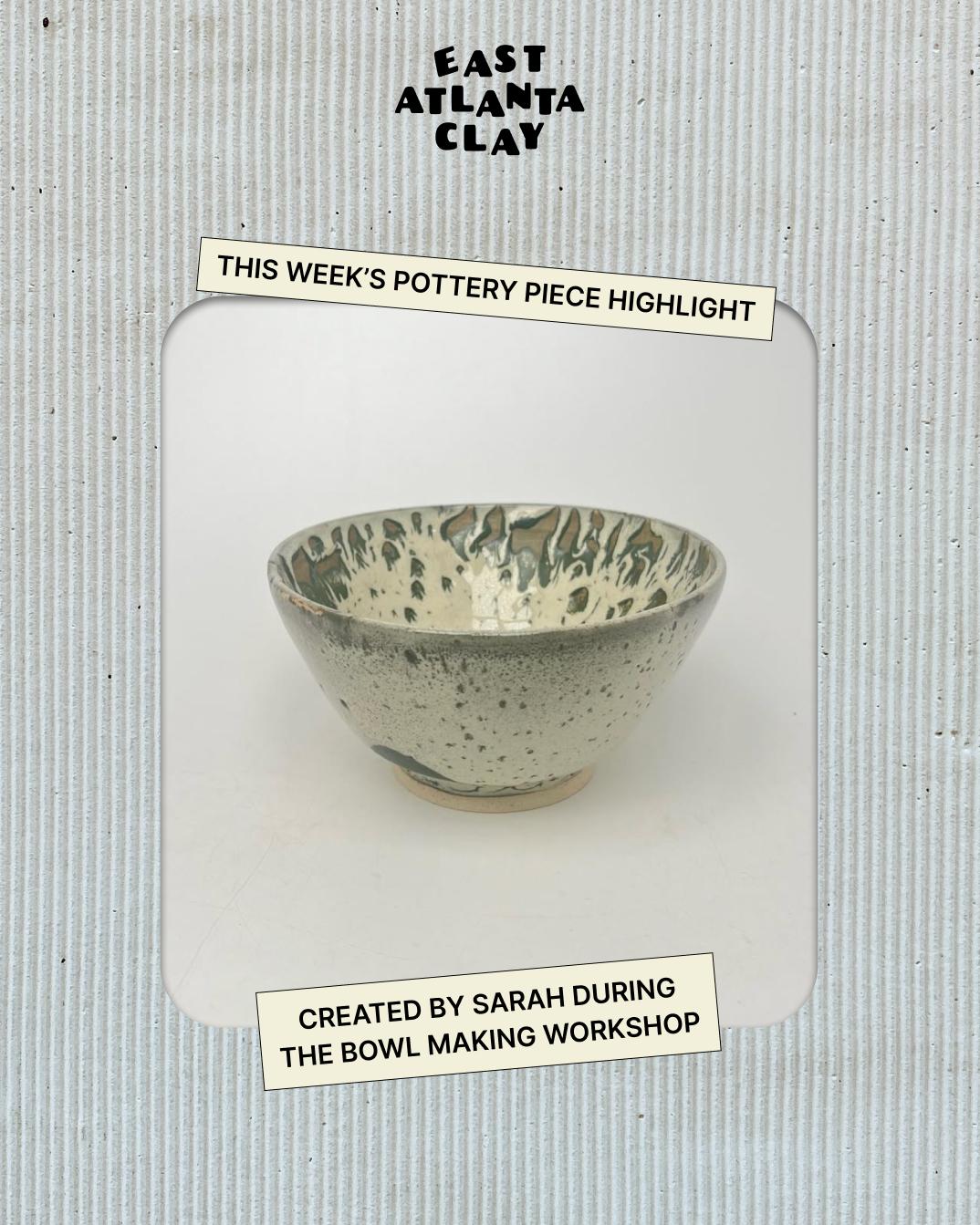
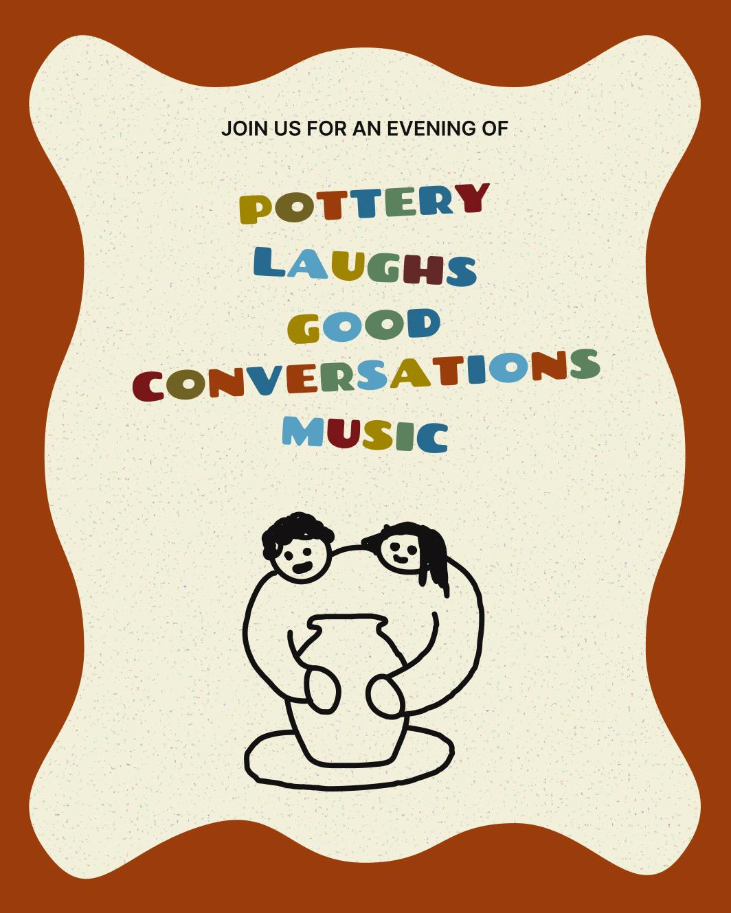
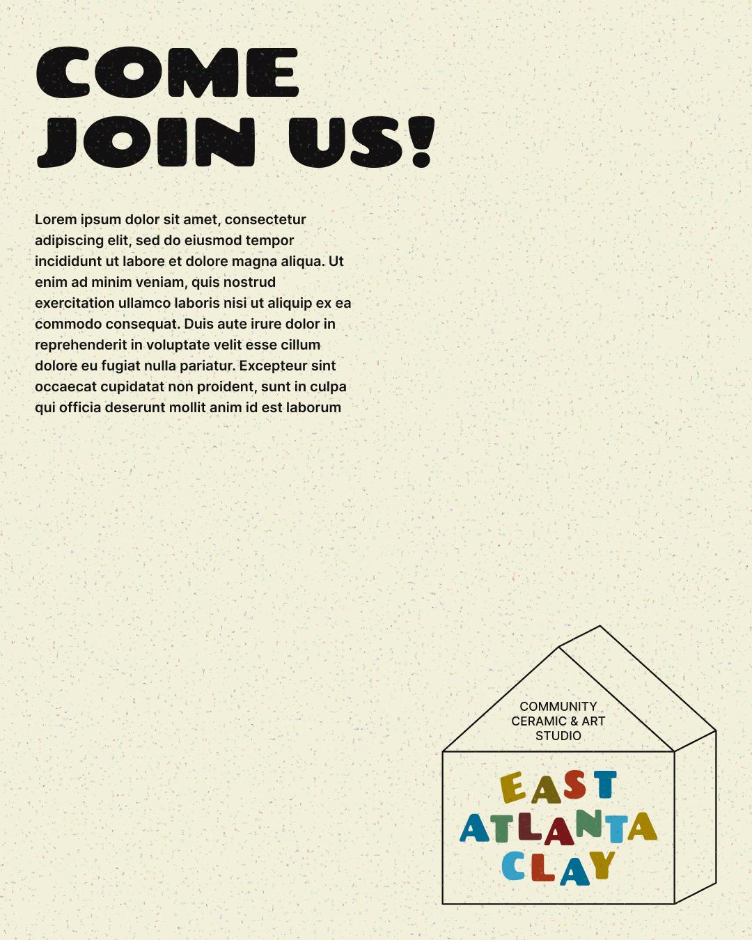
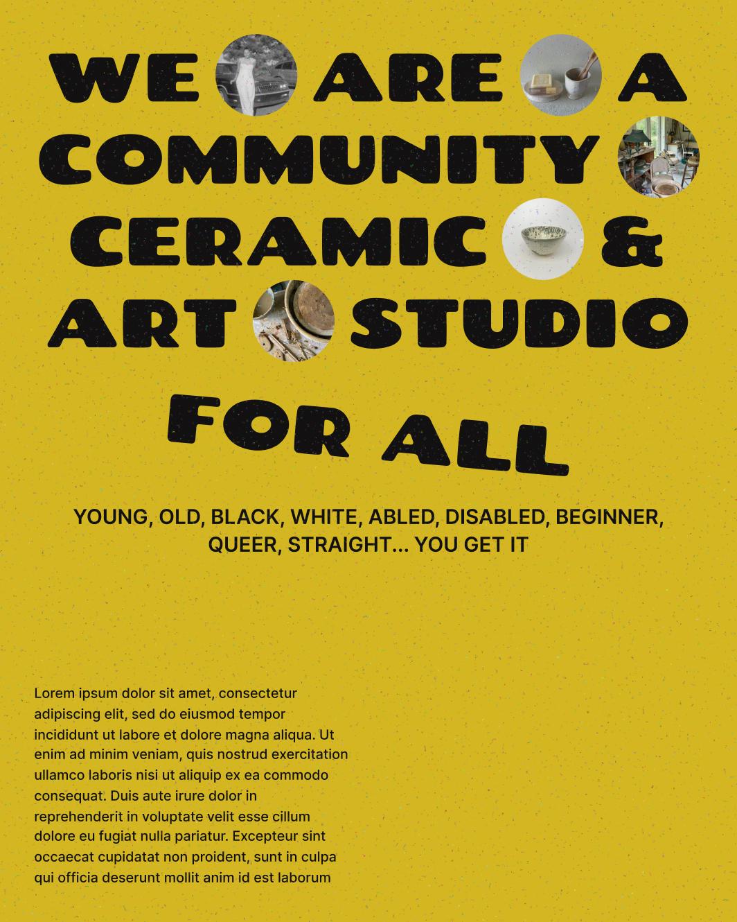
The brand follows the same logic. Nothing is too precious. Illustrations, patterns, and photo treatments feel handmade and a little loose, reflecting a studio where the process matters more than the outcome. All elements are dynamic and can be recombined endlessly to be flexible, yet unmistakably East Atlanta Clay.
Under one roof
East Atlanta Clay’s central illustration distills the brand’s ethos into a single, legible image: two people making a pot together.
The recurring house motif reinforces that idea of collaboration and belonging by framing the studio not as a facility, but as a home away from home.
Colours rooted in place
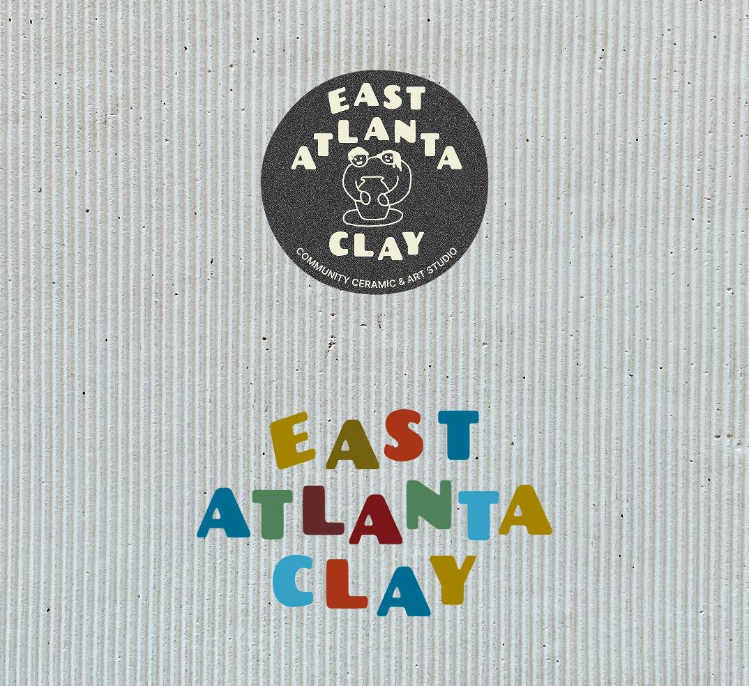
Blue and gold are Atlanta’s city colours, present in the city flag, civic materials, and even its transit system. By adopting them as the brand’s most prominent hues, the identity anchors itself directly in its surroundings.
I'd rather be at East Atlanta Clay
As part of the Kickstarter campaign, EAC wanted to send backers a studio hoodie as a thank-you. Merch essentially. When we brainstormed ideas for its design during our Sprint, we knew we didn't want to just slap the logo on a blank and call it done. It should be something that people actually want to wear because they connect with the concept the way they connect with the brand’s philosophy.
The garment became the brand's first real application besides Instagram graphics, and its most wearable mission statement.

Spreading the word
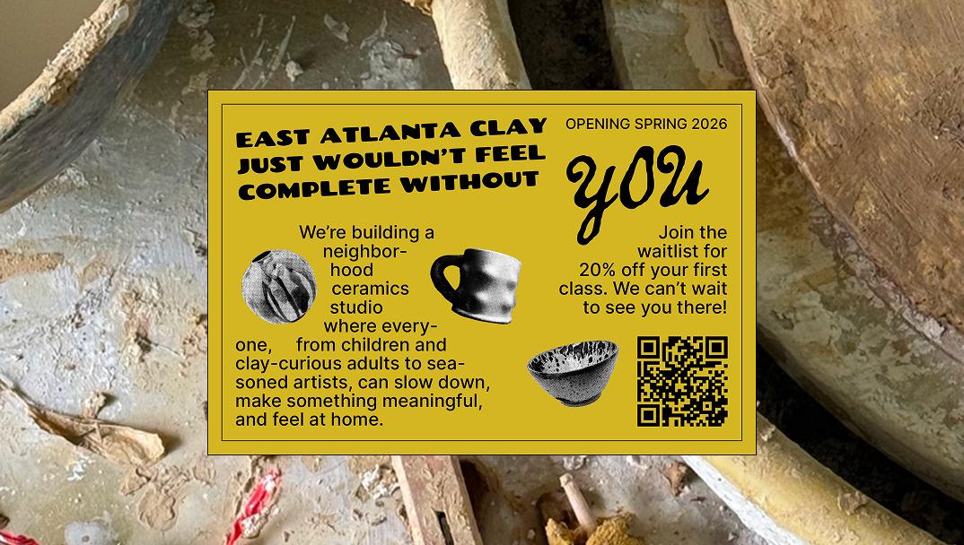
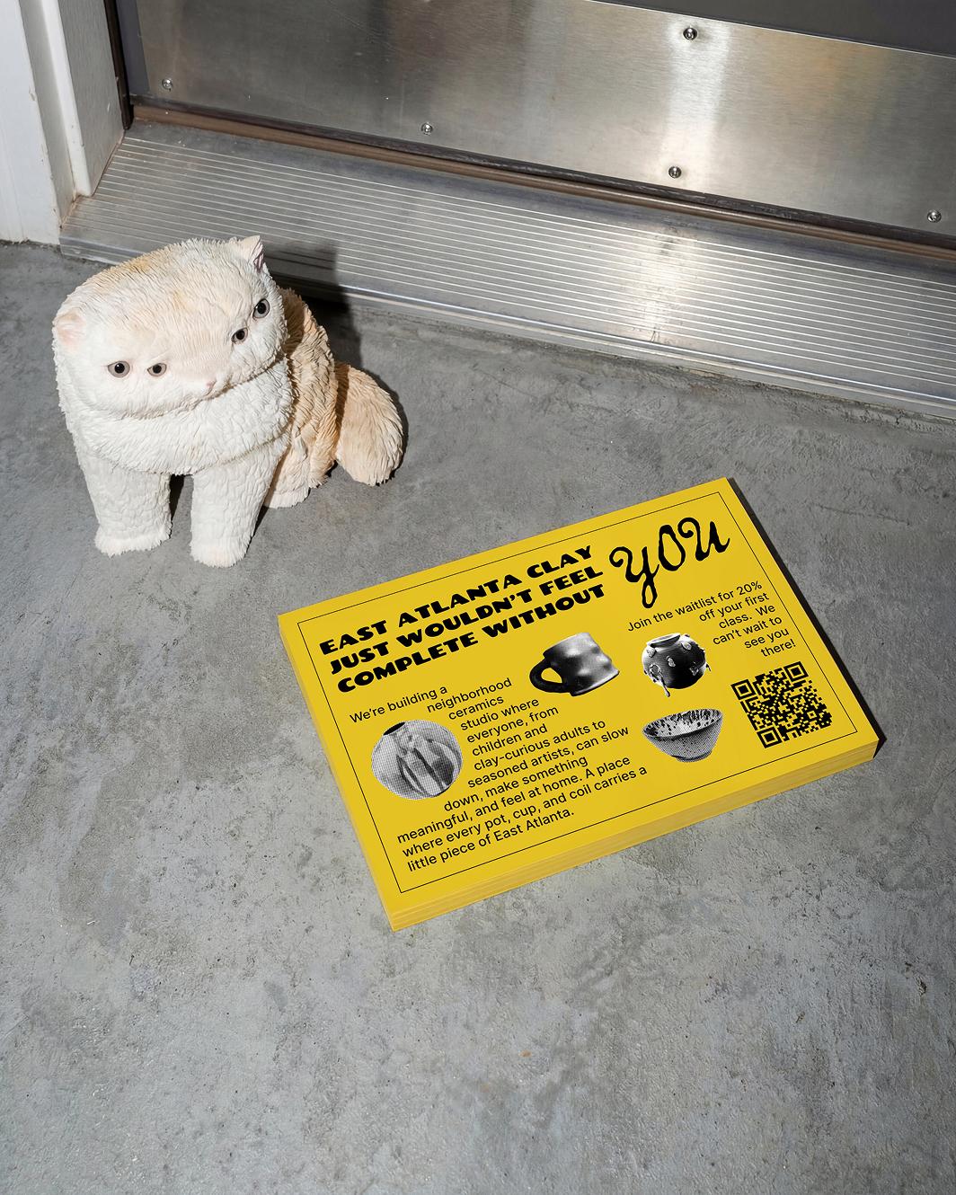
After the branding phase wrapped, East Atlanta Clay brought us back for one more job: a physical mailer (and accompanying IG graphic) to reach Atlanta's residents ahead of the spring 2026 opening. It lets people scan the QR code, join the waitlist, and get a discount on their first class. A small but perfectly considered way to start building a community early.


And the final result?
East Atlanta Clay now has an identity as warm, welcoming, and playful as the studio it represents. The doors aren't open yet, but the community is already forming. That means the brand is already working.

In the words of Founder of Ashanti:
“Working with Bitemark was one of the best decisions I made while building my brand. They have excellent design instincts and a strong sense of world-building that helps a brand feel alive rather than just styled. My input was meaningfully incorporated, while their expertise strengthened the work. It felt like a real creative partnership rather than a handoff.”
